Wheel Cake Food Stand ReBrand
A rebrand revisiting earlier work, applying formal UX and visual design principles to a long‑standing food stand.

Context.
Traditional Foodstand Rebrand · Project Revisit after UX Training
Role.
Brand Designer · VIsual Designer
Focus.
Brand Identity · Visual Systems · Physical & Digital Assets
Duration.
In progress
Team.
Personal
Tools.
Figma · Procreate
Business Overview.
2nd Generation Ownership Transition
20+ year family business entering its next chapter
Neighborhood Favorite
Trusted by generations of local customers
Traditional Market Setting
Located in the heart of busy sunset market
4.6 Google Rating
Built through word-of-mouth and repeated visits
Goal & Opportunity.
With ownership transition, there's an opportunity to strengthen the brand's online presence while preserving the trust built over 20 years.
Existing Brand Audit.


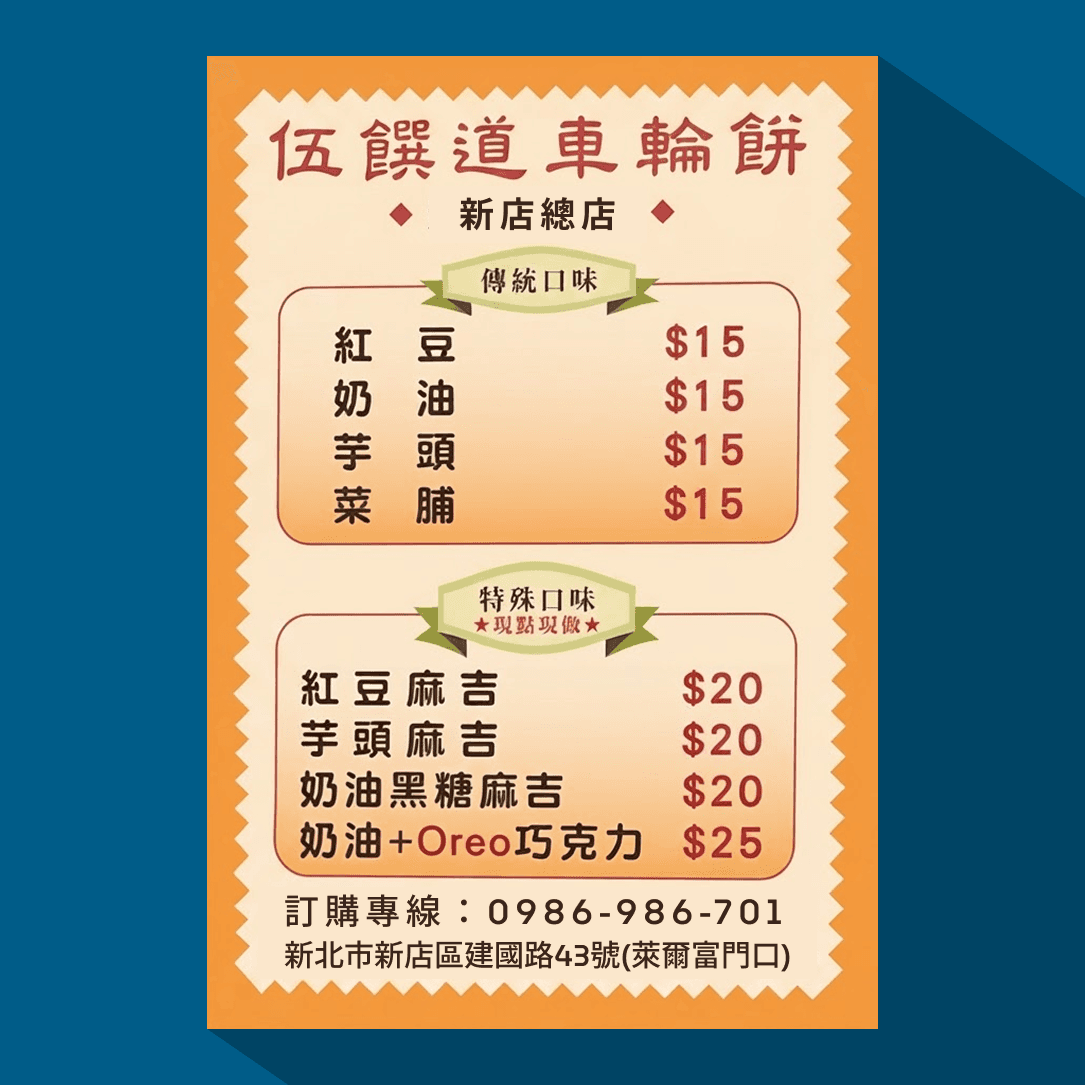
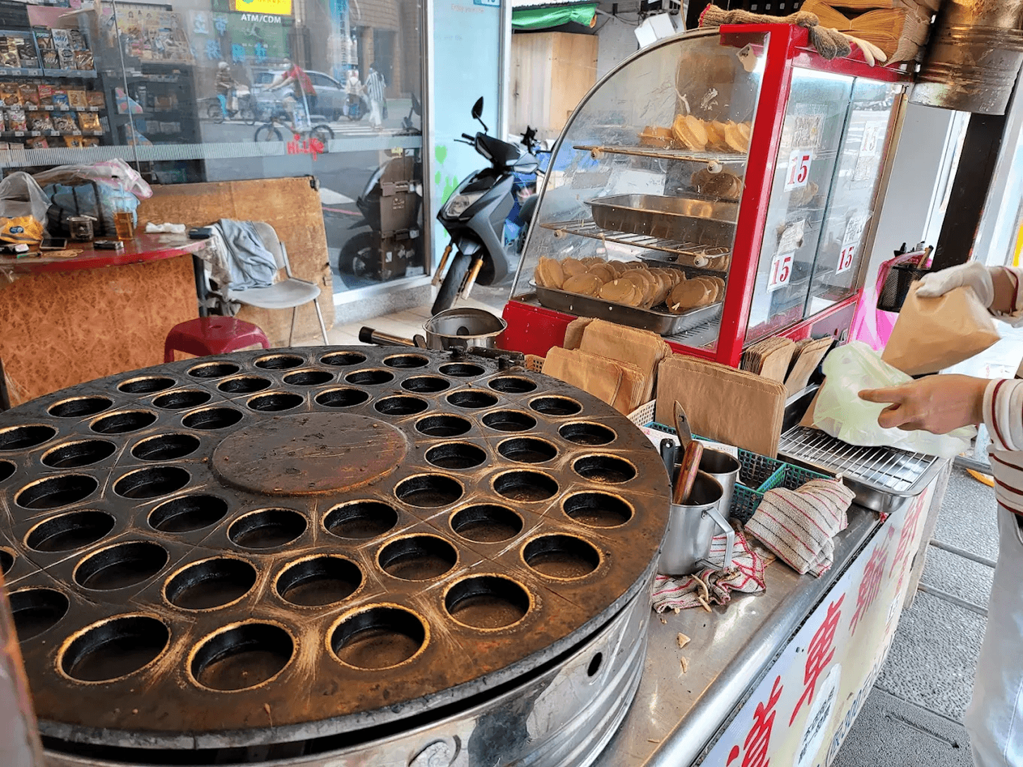
Strenghts
· Authentic and practical setup
· Communicates essential information without clutter
· Familiar to existing customers
Observations
· Visual communication varies across touchpoints
· Recognition relies on business name, not brand identity
Design Priorities.
Preserve Familiarity
Build on familiar visual cues already recognized by long-time customers.
Bridge Generations
Support both regulars and customers discovering local food online.
Improve Communication
Create a cohesive system across physical and digital touchpoints.
Identity System.
Family Name
Five petals representing both the family surname and the number five.
Ancient Coin
Reference to traditional coins and the Taiwanese phrase 有賺到 ("great value").
Wheel Cake
Resembles a wheel cake seen from above, linking back to the product.